The world of online furniture shopping is constantly evolving, and brands are always looking for ways to stand out. One company that has made a bold statement with its branding is Wayfair. Their vibrant purple logo and website design immediately grab your attention, setting them apart from the competition. But why did Wayfair choose purple?
This article will delve into the reasons behind Wayfair’s choice of purple as their brand color, exploring its symbolism, marketing impact, and how it reflects the company’s commitment to innovation and style in the home furnishings industry. We’ll also take a look at Wayfair’s diverse furniture selection and how their branding strategy contributes to their success.
Wayfair Brand Color
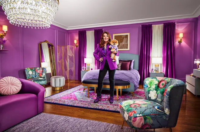
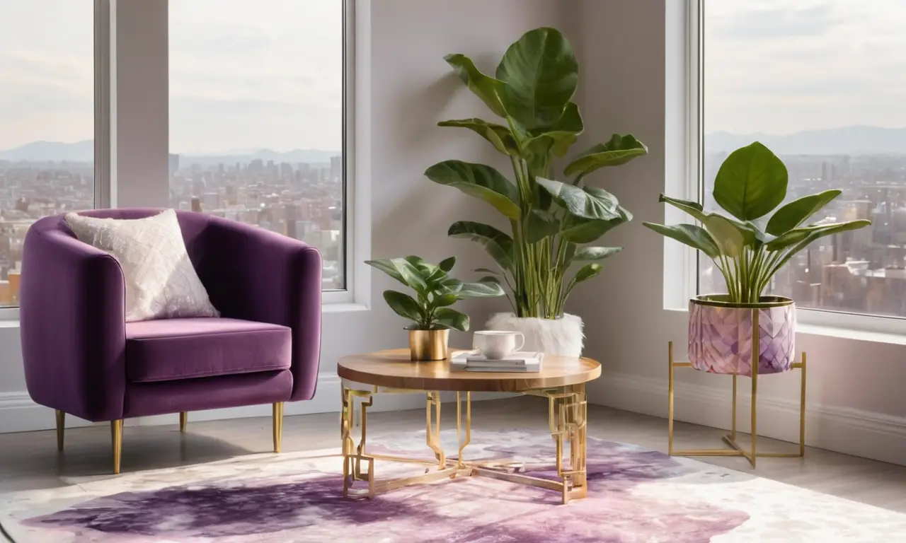
Wayfair’s brand color is a distinctive shade of purple that has become synonymous with the company. This vibrant hue is used consistently across all their marketing materials, from their website and social media platforms to their packaging and physical stores. The choice of purple was a deliberate decision made by Wayfair’s branding team to create a unique and memorable identity.
Purple is often associated with luxury, creativity, and innovation, qualities that Wayfair aims to embody. The color also stands out in the crowded online marketplace, helping Wayfair to capture attention and make a lasting impression on potential customers.
Purple as a Symbol of Innovation
Wayfair’s use of purple goes beyond simply creating a visually appealing brand. The color has deep symbolic meaning that aligns perfectly with Wayfair’s mission. Purple has long been associated with innovation, creativity, and forward-thinking ideas. This symbolism resonates with Wayfair’s commitment to constantly evolving and offering customers the latest trends in home furnishings.
The company embraces new technologies and design concepts, always striving to provide a unique and innovative shopping experience. Their use of purple reinforces this message, letting customers know that they are choosing a brand that is at the forefront of the industry.
Marketing Impact of Purple
Wayfair’s strategic use of purple has had a significant impact on their marketing efforts. The color helps them to differentiate themselves from competitors and create a strong brand identity. Purple evokes feelings of luxury, sophistication, and trust, which are all important qualities for a company selling high-value items like furniture.
The consistent use of purple across all marketing channels creates a cohesive brand experience that reinforces Wayfair’s message. Customers quickly associate the color with the brand, making it more memorable and recognizable. This strong brand recognition helps to drive customer loyalty and increase sales.
Wayfair’s Furniture Selection
Wayfair offers an incredibly diverse selection of furniture and home decor, catering to a wide range of styles and budgets. From modern and minimalist designs to classic and traditional pieces, there is something for everyone at Wayfair.
Their extensive catalog includes everything from sofas and beds to dining tables and lighting fixtures. The company also offers a variety of customization options, allowing customers to personalize their furniture choices and create truly unique spaces. This commitment to offering a wide selection and personalized experiences further reinforces Wayfair’s position as a leader in the online furniture market.
Conclusion
Wayfair’s choice of purple as their brand color was a strategic decision that has paid off handsomely. The vibrant hue symbolizes innovation, creativity, and luxury, qualities that align perfectly with the company’s mission and values. The consistent use of purple across all marketing channels creates a strong brand identity that is both memorable and recognizable.
Wayfair’s commitment to offering a diverse selection of furniture and personalized experiences, combined with their bold branding strategy, has helped them to become a leading force in the online furniture market.